Azur Lane - Centaur
アズールレーン「セントー」
Released: 2019年8月
By Kotobukiya
What do you get when you combine the lead artist of Sega's Shining series and a mobage (mobile game) about collecting warship girls?
If you're familiar with the Shining series, then you'll know Tony Taka—a renowned illustrator in the world of manga/anime style art. With Shining Resonance Refrain, Tony desgined the characters to show a mix of Asian and Western cultures. One of his mainstays in this regard are elves—germanic humanoid mythical creatures wearing Chinese and Japanese inspired clothes. Can't really say for sure if his approach to mixing cultures is nuanced, but I do know that it gives us some very interesting character designs.
Coincidentally (or not), the ship-girl mobage craze in recent years fits this bill almost too conveniently, and I personally find the juxtaposition of a Royal Navy fleet carrier and anime style art hilarious.
Cue HMS Centaur—a Royal Navy Light Aircraft Carrier active during the second World War. Or in the case of Azur Lane:
Today we'll be reviewing Kotobukiya's scale of Centaur.
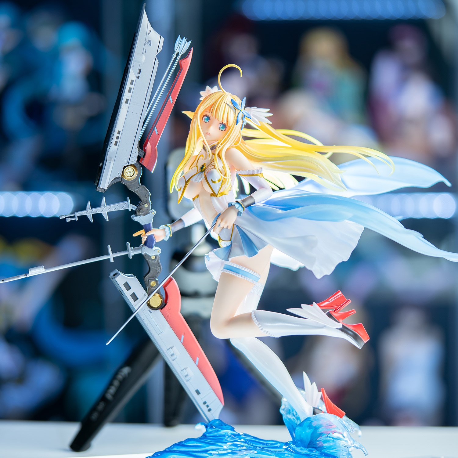
Standing at a 1/7 scale and 29cm, the first thing you notice is how dynamic Centaur's pose is! In comparison to Tony's artwork, the figure's left leg appears to be raised higher—a good change in my opinion, as it adds a more "dynamic" atmosphere to the pose.
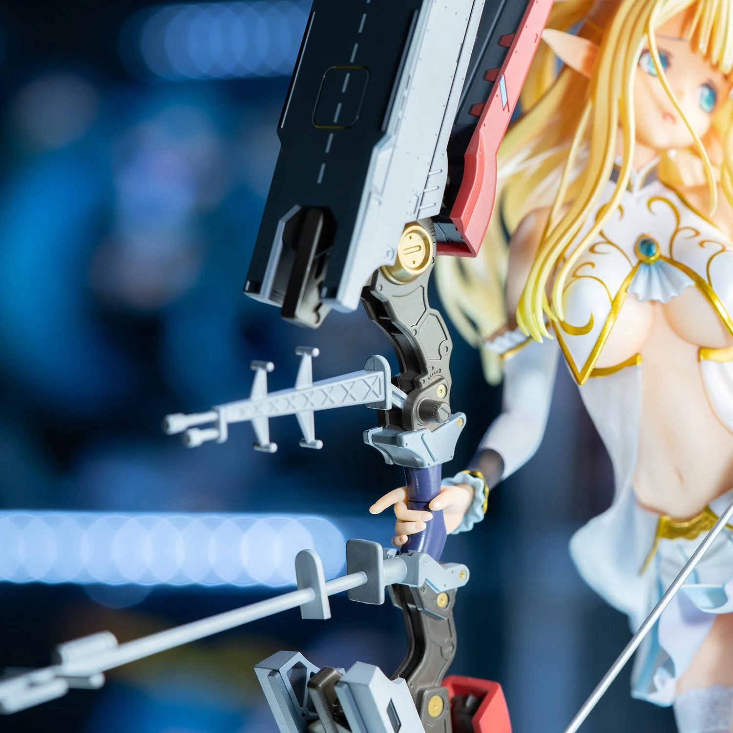
The second thing you'll probably notice is her aircraft-carrier-bow and arrows, featuring red accents on both the bow itself and the soles of her heels. I appreciate Kotobukiya choosing not to include the planes here as it would have added a lot of unecessary clutter. We shall return to the bow later, but for now lets take a closer look at Centaur herself.
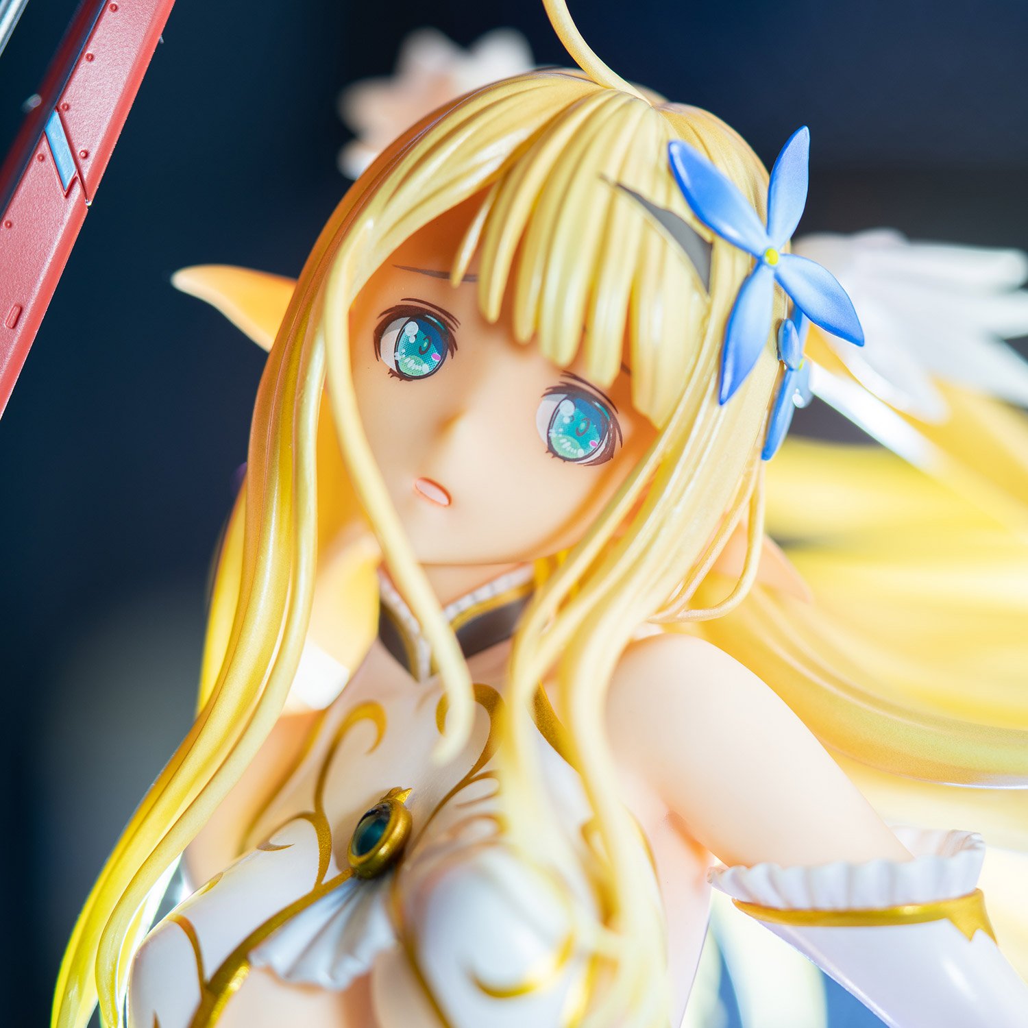
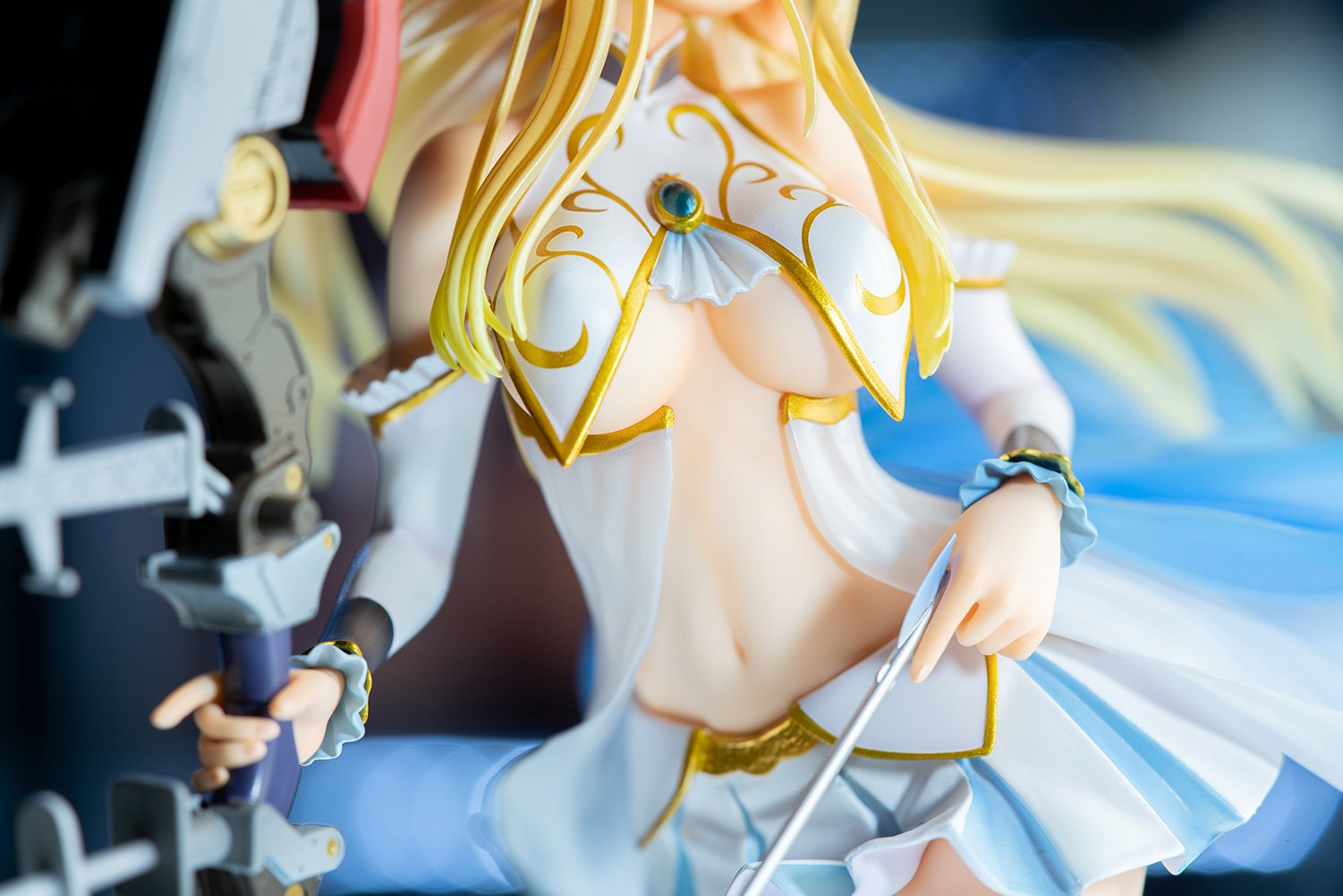
With her mouth ajar, Centaur stares somewhat nervously towards her left. I applaud Koto's effort on Centaur's eyes as they're surprisingly detailed and expressive! I think they've done a great job in replicating Tony's original artwork, including her blue flower-shaped hairpins and wing-shaped pigtail ribbons. This alongside the gilding on her clothes, frilly bits, and emerald brooch do well to evoke the "germanic" motifs evident in elven mythology.
A criticism I'd have which is also common in a lot of other Koto figures unfortunately is her hair. It seems to be. . . slightly off in terms of shade and texture to the original artwork. Regardless, the hair scult is actually quite nice and has good flow.
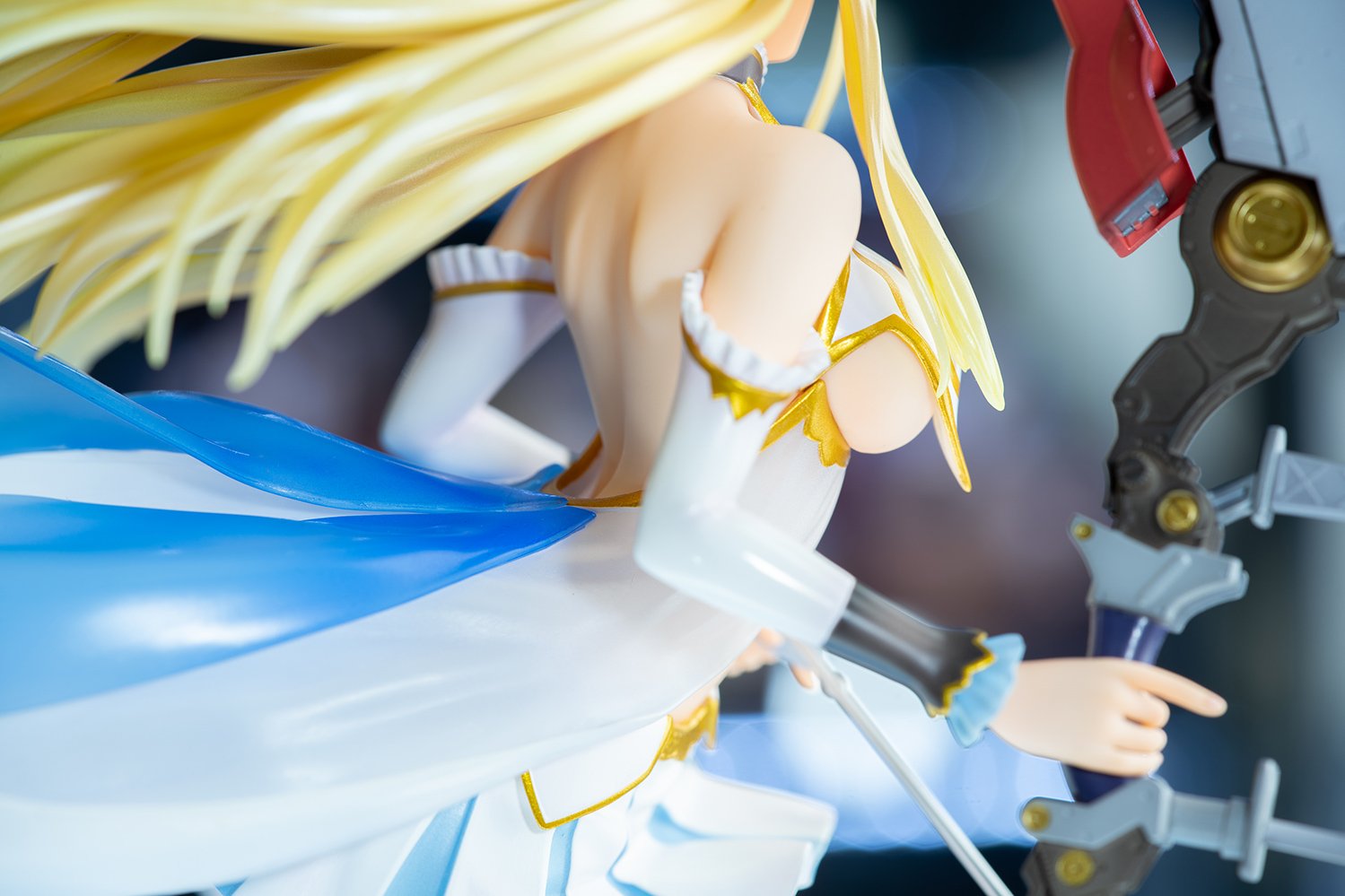
And yes, we also get a good look at the underside of Centaur's shapely breasts. Koto thankfully have not chosen to include a visible weld here—excellent! Perhaps we can thank Tony for this however, since his inclusion of a bluish ribbon attached to Centaur's brooch gives Koto a good place to hide said weld.
Moving further downards, we can see that the previously mentioned design elements continue; all the way from her armlets to her skirt. We do also get a nice view of her anterior side waist and belly, flanked by transparent cloth part of Centaur's top.
Oh, and dat arrow! On that note, it's time for the moment we've all been waiting for. . . Centaur's bow.
Being completely honest, Koto have exceed my expecations here. Generally in the past, I've found that they can more often than not do a poor job on props/fine details. While this isn't perfect (paint lacks texture in a few areas), the core elements of the bow in Tony's original artwork are present and captured to an above satisfactory level. Glad to see they've outdone themselves!
And while we're here. . .
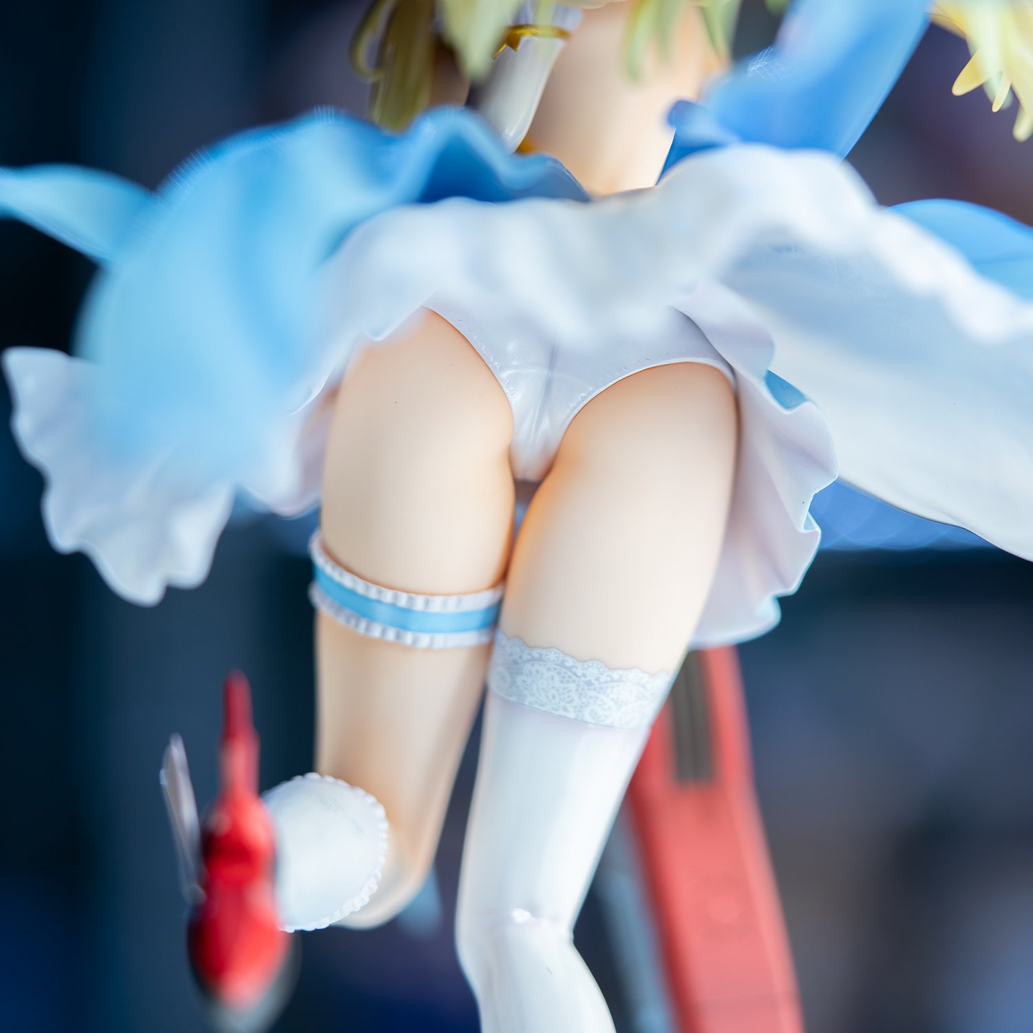
I will say though, this definitely isn't the best ass I've seen, I guess Koto thought that people wouldn't be seeing this part of the figure that much.
The legs themselves are not too bad, and there's some slight skindentation with her stocking and her garter (which isn't actually holding up anything but I guess it looks cool). The asymmetrical elements here are pretty nice and do well to bring contrast within the lower half of Centaur. Koto's glossy paint job works well here and I don't think much better could have been done so it passes.
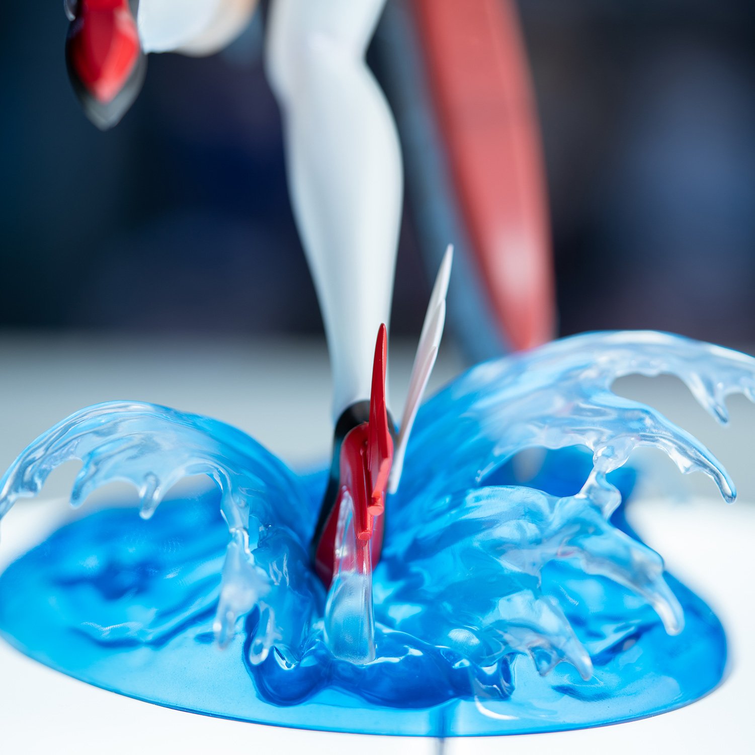
This is actually one of the better uses of Koto's water-based bases (heh) for their Azur Lane figures. It really fits well with the overall pose, where Centaur appears to be gracefully sailing across the seven seas! Of course, we also get a good look at her heels here which also feature the same red accents on her bow, and the wings on her hair.
To wrap up, this figure is actually pretty good. I don't really like reviewing figures that I feel aren't executed very well because it's pretty boring to write about the many flaws present in a figure. As a comparison, I was pretty disappointed with Koto's Akagi and Kaga figures as they had a whole slew of issues with quality control. This one is thankfully free of those issues, so my expectations have most definitely been exceeded to a great degree!
I do admit that I am a big fan of Tony's work so this may have a factor in my appreciation for Centaur. In any case, this is a well executed figure and is well deserving of my praise!
